
Health Alliance for Austin Musicians:
6% Increase in SEO, Major accessibility improvements
UX / UI Design / Analytics / 3D Design / CSS
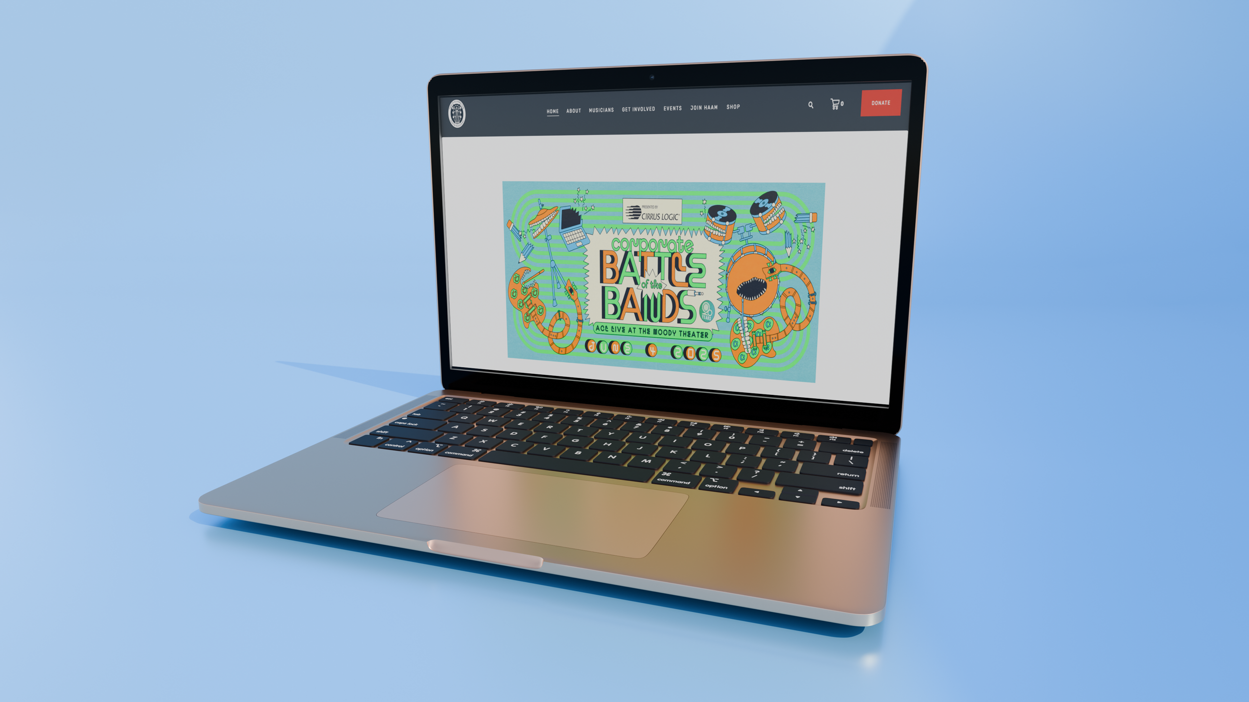
I revamped the website by creating a consistent design language system, conducting accessibility and text audits, improving SEO, and redesigning the navigation based on user data so that musicians can access the full extent of their benefits provided by HAAM.
ROLE
UX UI Intern
TIMEFRAME
Spring semester 2024-2025 , 5 months
Tools
Figma, Adobe Illustrator, CSS, HTML, Google Analytics
PROBLEM SPACE
Users did not understand the extent of their HAAM benefits, often failing to scroll to nearly half the resources provided.
IMPACT
+6% increase in SEO sitewide
Designed consistent design language system, along with templates for future non-designers to add web pages
Increase in accessibility, decreased CLS and added alt text
Updated website to the latest version of the host platform, making changing the website easier for employees
Coded bug fixes for overlapping text using flex containers in CSS
CONTEXT
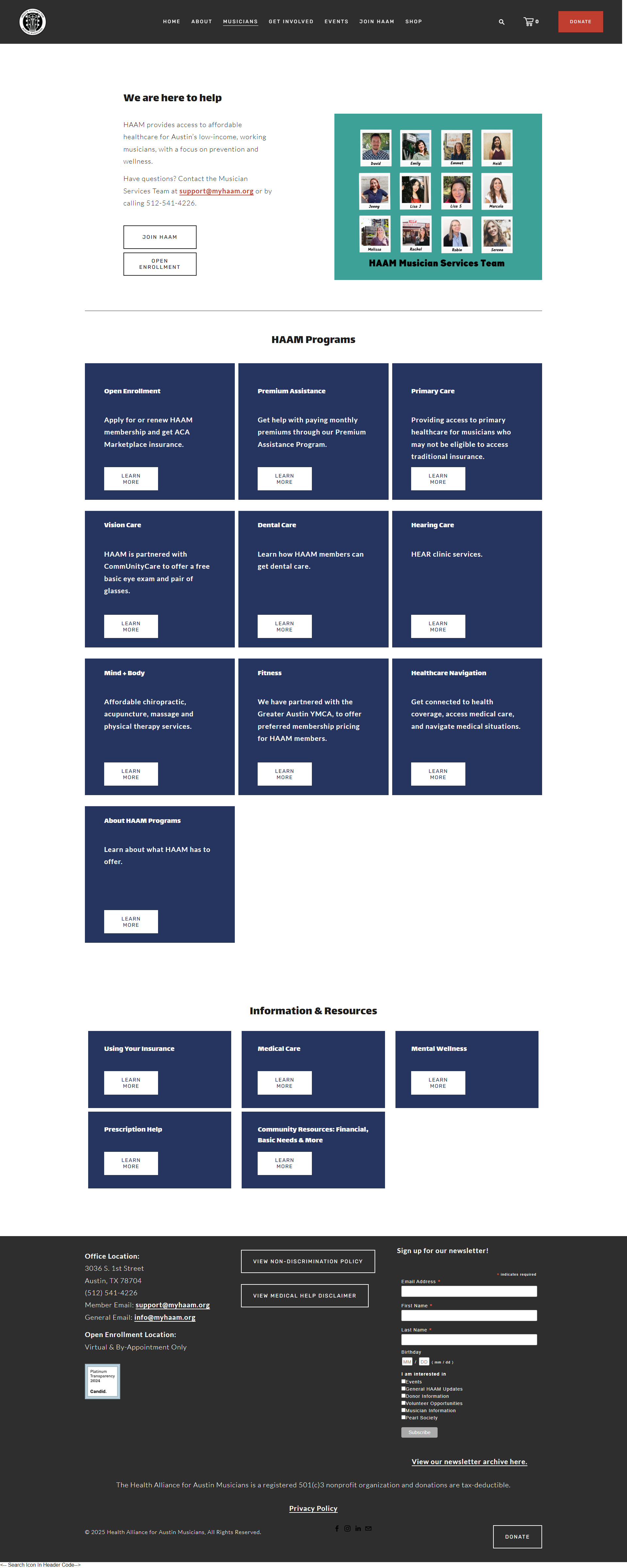
HAAM’s website had pages with massive amounts of information, large text blocks, and various alignments sitewide. This caused many musicians looking for insurance to be confused and overwhelmed when searching for membership benefits.
SOLUTION
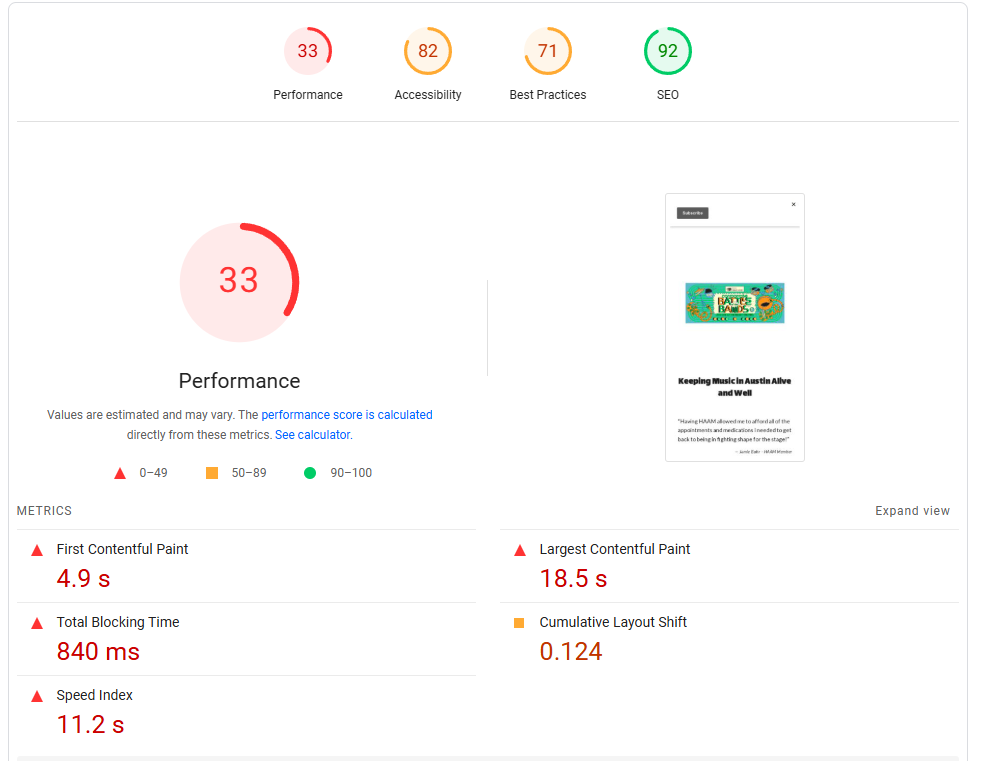
I conducted a web audit on all HAAM pages to understand accessibility levels, SEO, and Flesch-Kincaid Readability score to determine which pages needed immediate attention.
I created a design language system to create consistent column alignment and templates for future employees to use for the sake of longevity.
STEP 1
Conduct A web Audit
I revamped the website by creating a consistent design language system, conducting accessibility and text audits, improving SEO, and redesigning the navigation based on user data so that musicians can access the full extent of their benefits provided by HAAM.

HEAVY JARGON USE
Many terms were confusing, especially those related to healthcare
Vague navigation names: “programs” should be renamed to “member benefits”
Long text blocks could be made shorter
OPPORTUNITIES FOR OPTIMIZATION
Navigation pages appeared multiple times: “host a fundraiser” under “get involved” and “events” tab
Reorder navigation tabs from most popular to least popular
A chance for creating a template to create consistent pages with accessibility in mind
DESIGNING FOR ACCESSIBILITY
No alt text on any images
Large text blocks on images
Cumulative layout shifts occur often, and inconsistent text alignment
STEP 2 PERSONAS
WHO is HAAM FOR?
THE PROSPECTIVE MEMBER
Motivation:
Cares about potential benefits HAAM could offer.
Behavior:
Engages with HAAM website, swaying between “Join HAAM” and “Open Enrollment.” May not venture extremely deep into the resources offered.
Pain Points:
Wants a less overwhelming experience, with an easy step-by-step way to join HAAM and get benefits.
Design Consideration:
Create an easy, step-by-step guide to joining HAAM that does not include lots of medical jargon.
THE LONG-TIME MEMBER
Motivation:
Needs immediate use of member benefits. May also be looking for HAAM events to participate in.
Behavior:
Engages with the HAAM website occasionally, usually getting information/coming from newsletter updates.
Pain Points:
Wants information on HAAM member benefits, mainly dental, vision, and hearing clinic services.
Design Consideration:
Reorder navigation and member benefit order based on popularity and members’ usage.
THE DONOR
Motivation:
Cares about HAAM events, merch.
Behavior:
Engages with the about, events, and shop sections exclusively.
Pain Points:
Ecourage donation to HAAM without donor fatigue. Also encourage attending major music events.
Design Consideration:
Design the about page for those who may not know about HAAM with a clear mission statement. Design the home page to encourage going to the about section.
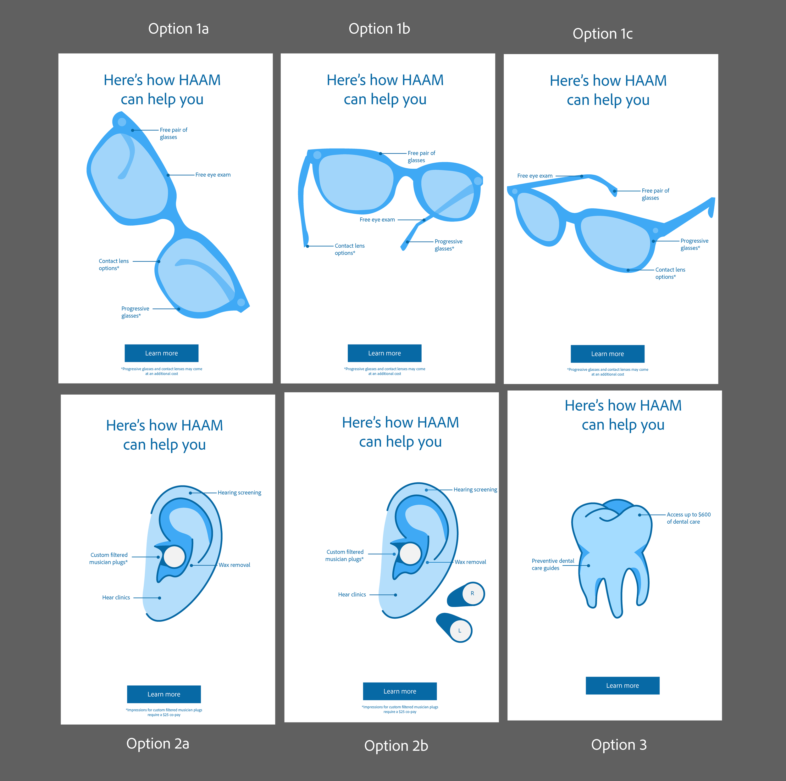
STEP 3
IDEATE & FEedback
Design goals: Design a megamenu for easy use and ensure it aligns with user needs. Redesign the homepage to feel more lively.


Initial icons for menu and navigation
CREATE CLARITY FOR USERS
Insurance can be confusing, and it’s a designer’s job to help guide them through their experience.
User icons for easy visual navigation
Change color contrast to be WCAG AAA compliant
Create a megamenu with descriptions, which lessens confusion
Mockups for newsletter campaign and social media posts
Before and after changing colors to be WCAG AAA compliant
STEP 4
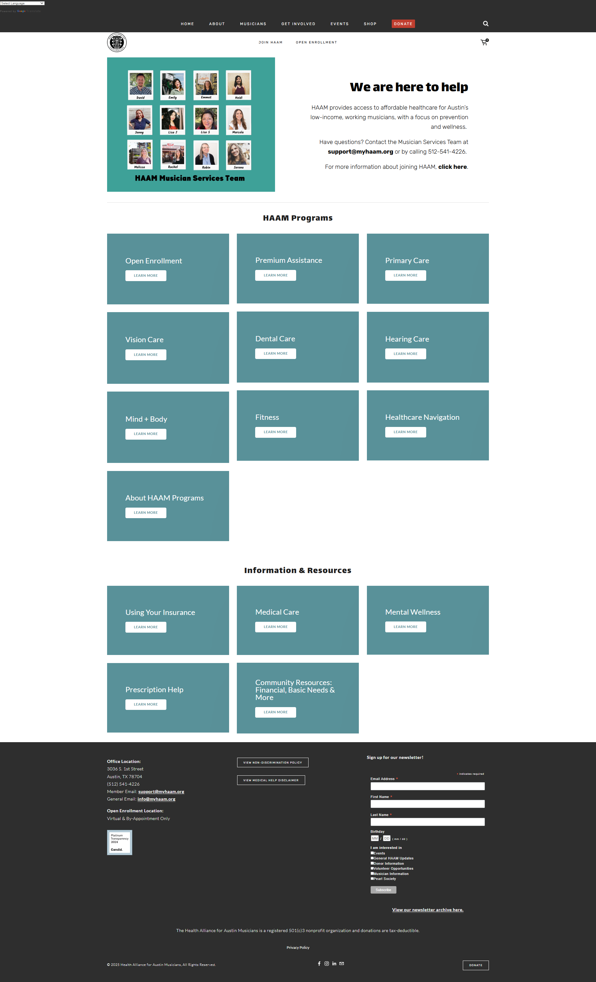
FINAL DESIGn
After feedback and ideation, I finalized a design language system that promotes accessibility and aligns with the brand image. Due to time constraints, the full extent of the megamenu mockup was unable to be fully implemented by the time my internship ended.
My long-term vision: Impliment the megamenu on the home page

Design language system


Newsletter campaign and social media post for vision insurance resources
Megamenu mockup
STEP 5
Analyze impact
Adding keywords, meta tags, descriptions, and alt text all let to an increase in SEO rankings as well as accessibility. To ensure these design principles stand the test of time, a template has been added for non-designers to create web pages according to the HAAM design language system.
6% Increase in seo
Increase in Accessibility
Long lasting change with templates
This project reinforced the importance of lean UX methodologies, and in the future, I’ll incorporate more qualitative and quantitative feedback, even if the timing is tight.